Thursday 21 March 2013

EVALUATION QUESTION 4

Question 4) How did you use media technologies in the construction and research, planning and evaluation stages?
Throughout the research and planning stage, one primary technology I used was web 2.0. Firstly, it was vital in finding our unsigned artist, Carl Martin, on ReverbNation, a site where unsigned artists sign up and upload their own work in an attempt to share their talent. Without the use of web 2.0, we would never have been able to find Carl's work, and create this media package.


I also used
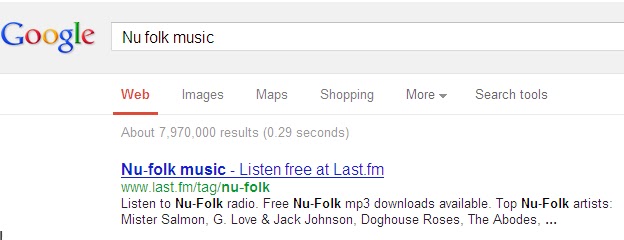
the search engine, Google, to research and plan my package. It was iuncredibly useful in finding other media products within my selected genre, to give me idea's, inspiration and creativity for my own products.
 Furthermore, the internet streaming website, Youtube, was tremendously helpful in my research and planning stage as it allowed us to view similar music video's to the genre we were working in, and helped us to develop existing idea's into our own idea's, which we then applied to the media package. Examples of this include Ed Sheeran's A Team, Alt-J's BreezeBlocks, and a number of other video's within our genre. We were also able to view not only music video,s but also the Skin's series, and the Black Swan dance scene which became so influential in our work.
Aside from search englines and internet streaming, Blogger also became a vital part of my research and planning as it enabled me to keep track of my work, and ensure that everything to do with my media package was well organised. It also provided me with a thinking place for any potential idea's that I felt would be suitable for the package. It became a fantastic help especially when recieving audience feedback, and allowed us to briefly summarise what had been said, to enable us to encoorperate this into a package.


Other technologies used were Microsoft PowerPoint, and the similar powerpoint creation app Prezi. Both fo these helped me when presenting the Pitch to my peers about my ideas, and allowed me to present my findings, mood boards and similar products in a conventionaal, and technology friendly way. I also used a Nikon DS60 SLR camera to enable me to capture different aspects relating to my media package, including location idea's, drawn idea's, safety hazards, and a number of other uses. Alongside this, when the professional camera was unavaliable or I did not have it to hand, I was able to use my Samsung Galaxy S3 8MP camera to capture spontaneous images that I thought would help me later in the procedure of creating my package.

Throughout the production and post production of my pac-
kage, a number of technologies allowed me to achieve my end product.  In regards to my music video, the primary tool of use was a Panasonic HD video camera, which enabled me to capture high quality footage, for our music video. With many different options in terms of contrast and e
ffects on the camera itself, it proved to be a fantastic way of capturing my footage. As an accessory to this, I also used a tripod which enabled me to capture footage without shaking the camera, therefore maximising the proffesionalness of the package.

However, lighting also played a key part in the production of my music video. I used a range of lighting accessories, including 2 Battery Powered LED lights, and large studio lights to ensure that the lighting was suitable for each scene we shot. To do this, we also used a number of different coloured filters in front of the studio lights as this gave us a range of options when shooting the video. Both of these lighting equipments helped to convey different aspects of our video, including the close up shots, the bath scene and the black swan scene. Without the lighting, I feel that our video would have lacked personality, and would have resulted in the audience seeing the video as dull and boring.


In my ancillery task, I used a range of technologies to create my digipak and advert. Firstly, the Nikon DS60 SLR enabled me to take high quality photo's for my advert, and inlay of digipak. I also used my Samsung Galaxy S3 to capture some of the images on my front cover collage, if I felt that the particular image suiuted my theme and a professional camera was not readily avaliable. In conjunction with this, adobe Photoshop became a key tool in producing my ancillery texts. It provided me with the template I needed for my digipak, and enabled me to create features such as the replication and ink effect I used on my advert. I was aslo able to develop the colour.. via photoshop which proved to be a key aspect in housestyle according to my feedback. The sepia effects allowed me to make my collage photo's much more pleasing to the eye, which was also a critical aspect of my digipak.

In regards to the editing of my music video, I used adobe Premier Pro as the editing suit in which to create my video. Simple and easy to use, it allowed me to store all my clips in one place, rename them, and generally worked well as an organiser. Effects on the programme such as transitions, mirroring and ........ were all easy to use on my video, and resulted in the sucess of my package. The clips were easy to edit, and easy to move to and from the timeline, to ensure minimal confusion. I would definitely use Premier Pro again to edit my video.

Throughout my evalutation, I have used a number of technologies. I have used windows movie maker to create the video in question one. As the evaluation was done at home, if more technology was avaliable, I would have used Premier Pro to create this movie. I have also made good use of PowerPoint and Prezi in both questions 2 and 3, to show my evaluation in a range of technologies. I have included relative Youtube clips, and other images to provide an accurate representation of my genre, and how my media package was able to stick to or break the conventions of my folk/NuFolk genre. I also used my Samsung Galaxy S3 to get feedback from my target audience, and printscreened the responses, emailed them to myself using Hotmail, and then embedded them on Blogger. Evidently, Blogger has also played a key part in the evaluation, providing me with a free and limitless space to write construct this evaluation.


EVALUATION QUESTION 3

Question 3) What have you learned from your audience feedback?

When creating my media package, I knew that audience feedback prior and post production was vital in ensuring that my product succeeded in pinpointing and maintaining audiences attention. Prior to video production, we had a very clear idea of who we wanted to target for our package. We displayed these idea's in the form of a pitch, which we presented to a class of media student's, to receive feedback and build on our idea.


Our intended target audience was very specific, and we felt this was necessary as our genre is quite a select and individual area of music. We decided that our target audience would be from the ages 16-24, targetting the teen to young adult audience. We also concluded that, due to the nature of the music, our audience was likely to be predominantly female, with a socio-economic rating of B to C1 (outdated) and a psycho graphic rating of mainstream.  After presenting the pitch, we found that most of our idea's were generally accepted by our audience, and that the idea's fitted into the genre of our video.


After the pitch presentation, we also decided to play our song to the same target audience, and have them complete a synaesthesia activity to improve the amount and accuracy of idea's for our music video.  We found that most people associated the song with depressive traits, such as rain, and dark scenes. Therefore we included the use of dark lighting and close up shots to convey emotion and feeling.

In regards to post production, I decided that it would be good to ask 2 audience members from my intended target audience about how they felt about the text, how and what they have they have taken from the text. 
I found that the two audience members, felt that the music video had been what they had expected from the genre folk/Nufolk, but with some elements of entropy, such as the Black Swan scene.  They felt that the text allowed them to relate to real life, as teenagers, and felt that they could relate their own experiences to the video, with the use of closeups conveying emotion and feeling. Pleasures offered included emotion, feeling and sensitivity, connoted through the use of closeups, and soft colours on the digipak. They were able to develop these pleasures from prior watching of music video's in my genre as a form of cultural capital.


EVALUATION QUESTION 2

Question 2) How effective is the combination of your main product and ancillary texts?
When designing my media package, it was imperative that both my music video, and digipak and advert had a coherent house-style, and worked well together to attract audiences to my actual product. It was also vital that the two texts worked well together to provide an accurate representation of the genre, and maintained a consistent house style throughout.

To research how effective my products worked together, I had to do some target audience research. My specific target audience was teen to young adult,  therefore I got feedback from this audience. However, I also asked people with less cultural capital, outside my intended target audience to give me a wider and more varied perspective of the coherence of my package. Due to this variation in Cultural Capital, this resulted in the feedback from some audience members being less specific and lack of jargon being used to describe my my package. This could be down to a number of reasons, firstly because some of my research members were not media students, or not students at all. Class could also play a part, and how much interest in music video's they have also effects the quality of feedback.


When doing my research, as I am no longer a user of Facebook, me and my partner Beth set up a forum on her Facebook to receive feedback from our media peers and other outsiders, as you can see to the right.

If I were to re-do my package, I would definitely use social networking again as it is a fantastic way of getting fast responses from a select number of audiences. I also showed my video and package to a number of people outside facebook, and saved their responses via text on my Samsung Galaxy S3.


Feedback Analysis
Megan Stanley, 18, University Student
'I thought that the video was really good, and that it worked well with the album cover. Both had a simplistic house style but maintained the ability to capture an audience. I thought that the music video was good because of the close shots of the actor, and the lighting made it dramatic. I thought the pictures on the front of the cover of the album were suitable and worked well, and I also really liked the tracklisting as it was original. I liked the advert too, but did not really fit in with the other two pieces as it was quite busy and did not maintain the simplistic house style.' 


From Megan's feedback, it is clear to see that she felt the simplistic housestyle suited the genre that I had aimed for. This was a key point, as I had focused a lot of my attention on trying to make sure I kept the housestyle simple, while be able to get peoples attention. The idea of using a simple housestyle had been an idea of mine since the research and planning stage, and having used this style effectively, in both my music video and ancillary text, it suggests that my package did have elements of coherence. However, Megan did comment on the lack of coherence of my advert to the rest of my piece. I realised this as an issue almost immediately afterwards, and if I could go back and edit the advert I would definitely try and maintain the simplistic housestyle that megan felt I did so well on in my other texts. A further comment from Megan was about my use of collage on the front cover. This shows that whilst being able to maintain a simple housestyle, a digipak can still look effective. I also felt that the use of the collage worked well with the folk/Nufolk genre, and Megan's comments confirm this idea. A final point Megan made was about my design of the tracklist. She stated that the idea was original, which is what I had intended when I deviated from creating the tracklist in a handwritten style on a computer. One of my genre's main aspects is originality, therefore my product can be seen as coherent with other products within my genre.

Katy Bassett, 18, College Student
'I think that both the music video and the album cover and advert worked really well together. I really liked the fact that the ending was at the start, and that made me want to watch more of it to see how that result came about. I thought that the video was a bit like a story which was also a good factor, as it allowed me to relate it to teenage life. I thought that the use of closeups was really good as well, as it allowed me to see the emotion and the feeling of the song in the acting'

Katy began her feedback by identifying that the music video and the album cover and advert worked really well together. I was surprised to hear that she thought the advert was coherent with the rest of my media package, as my adverts style is not openly recognised in this genre specifically. But it can be seen that by breaking the conventions of my genre, I was able to open up my audience, and appeal to a larger scale. Her comments about the music video and album cover working well together follows on from Megan's earlier comments about the two texts, suggesting that coherence between the two is strong, and that the two can be associated with one another. Kate also commented on how the video was 'story-like'. This can be interpreted in a number of ways, as our initial idea was to not give the audience this impression as it would break the conventions and ideas of real media texts within my genre, which are normally highly performance orientated. However it can also be seen that our video has outlined the narrative well, and her comment about being able to relate it to teenage life was a great positive to our work, as music videos in our genre are meant to inspire and have a plethora of meanings. If each one of our target audience members watches the video and is able to apply it to their own lives then we have successfully kept the to conventions of real media products. Kate also liked the idea of the ending being at the start and the video working its way backwards throughout. This was highly positive as we wanted to apply Todorovs theory but vary it slightly, as we had seen in our research and planning videos. It can be seen that this style of structure is highly effective in keeping the audience interested. Kate also commented on how she liked the use of closeups, which we felt was essential in portraying the emotion of the song. She stated that it alloerd her to see the emotion and feeling of the song in the acting which is great as it shows how we used Goodwins relationship of visuals to sound effectively.

Lucy Allen, 18, University Student
'I like the way the video is almost like a story, it makes me want to find out the ending - which is good because usually I dont pay much attention to music videos unless they are captivating. I also like the lighting as it gives it a dramatic effect and conveys the emotions they are both feeling too, which makes the video quite emotional and interesting. I also really like the way in which the end of the video linked back to the start as it made it seem quite continuous snd made it flow really well.'

Lucys feedback also commented, like Katy on the style of the music video being like a story. As stated earlier this not exactly what we had intended, but like Katy, Lucy saw it as a positive, stating it made her want tk watch the video to the end. This is highly beneficial for us as we wanted our texts to be interesting for the audience. She also felt that the lights gave the video a firm sense of emotion and feeling. When creating the video we used a number of different filters on the lights to find the perfect effect for each scene, which is good to see that the filters had the desired effect.  

I knew that it was important for my media package to be coherent in aspects of the design. Some elements of coherence in my package include:

- Colours
The use of colours between my digipak and advert is one aspect that can be seen as coherent. The colour ............ was used on my advert and the colour ................... was used on my digipak front cover and side. Although not directly similar, both colours have similar properties and connotations which allows them to be associated with one another, which was important in the design of my product as I needed to ensure my audience could make the link between my advert promoting the digipak. I also used the colour black on my fonts consistently throughout my package, in the fonts on my ancillary texts and in my music video. I felt this was important in maintaining a coherent house style between the three products.


-'Handwritten' features


The use of the handwritten feature was evident in both my tracklisting and my music video. I liked this feature, and seeing it on Jason Mraz' album cover reinforced my decision to use it within my texts. I felt that the use of this feature in my ancillary product gave my artist a closer link and more direct link with his audience, and allowed the audience to grasp a more personal and intimate relationship with the artist himself. I also used the hadnwritten feature in my music video, as can be seen to the right. I felt that this reinforced the home-made feel my video had. Within the folk/Nufolk genre, I found in my research and planning that originality was key to the production of a package like this, therefore my package also has coherence with the genre itself.

- Use of intruments
Within my ancillary product there is a continued use of instruments in the advert and digipak. As you can see, I used a part of the guitar on the in-lay behind the CD, and also used a guitar in the image that i replicated in my advert. Within my music video, there are a number of shots where the singer is accompanied by a guitar as a prop within the scene. When doing my research and planning, I found that often in packages within this genre, artists/bands often posed with their instruments, therefore I decided to replicate this idea in my own work. This element of coherence allows my audience to understand what sort of artist he is, and what genre he fits into.

Elements where my media package was not so coherent include:

-Fonts
Although similar, the fonts I used on my digipak and advert were not the same. On my digipak I used the font Harabara, and on my advert I used ....... and ........... Looking back on my text now, I feel that .....was far too flamboyount and outrageous to have played a part in my advert, and If i were to go back, I would change this to maintain the coherence and housestyle my package has.

-Advert
After recieving feedback from my peers, it was clear to see that many of them, including myself, felt that the advert simply did not fit into the housestyle of the rest of the package, or genre. They felt that the use of symbols as a background made the advert far too busy, and dettered from the simplistic housestyle i had originally intended to maintain. Obviously this is an element of lack of coherence, but as I found in my feedback it did work well in attracting the adiences attention.

-Actor
As the music video w as joint effort between ymself and my partner, and the ancillary product was individual, two different actors were used in the digipak, and only one fo them could play the part in the music video. Unfortunately my actor we felt was not suitable enough for the part, therefore played no further role in the production of the package, adding a further element of coherence.


EVALUATION QUESTION ONE

Question 1) In what ways does your media product use, develop or challenge the forms and conventions of real media products? 


Transcript


When looking for inspiration for our music video, we found that this played a key part within the research and planning of the text. To do this, we looked around at a number of music video's within our genre (Folk / Nu-folk), including Ed Sheerans 'A Team' and Jack Johnson's 'Better Together'. We looked at these video's as we felt that they provided us with an accurate idea of what our intended target audience, primarily teens and young adults, wanted from a music video. When looking at Sheeran's video 'The A Team' 
"we particularly liked the use of black and white shots, which we incoorperated into our own work. However we differed from the continued use of the black and white, which is seen throughout Sheerans video, and used it selectively, in parts of the video where we felt the black and white effect suited the music best.  The black and white effect combined with the 'homemade' feel of the video, gave Sheeran's video a simplistic, yet effective look, something which we felt suited our genre and audience. Another key aspect that we found effective was the use of narrative within this video, which gave the video a Goodwin-esque feel to it, sustaining his amplification theory. We tried to replicate this, by following both Sheeran's idea's, and Goodwins theories on the relationship between visuals and audio. It follows the life of a young troubled teen, on a, sort've quest for enlightenment. But it was shot in a way, which provided the audience with potentially a number of entropic and redundant connotations. We felt that this was a key concept to include and maintain for our video, as it provided potentially both originality, and some stereotypical connotations, based on the way the video is perceived by viewers. 

We also used a number of other features in our video, such as the close up's you can see here, which we then replicated in a way to communicate to the audience the emotions and feelings our video is intended to convey.  Sheeran's A team also opens with the death of the actress involved. This idea had occured to us before viewing Sheeran's video, but this gave us more clarification about the idea, which we eventually did decide to use. This 'back to front' structure disrupts the Todorov feel to our video.


Our Process went as such : NEW EQUILIBRIUM + DISEQUILIBRIUMEQUILIBRIUM.

These idea's specifically came from watching a number of videos, both within our genre and outside the genre. Personally, I had watched Sheeran's A Team video, and Alt- J's Breezeblocks and grasped the idea from that, but my partner also found the style in Trey Songz - Heart Attack. Although this song in particular was outside our respective genre, we felt that getting a number of idea's about the structure of our video was imperative in making the video interesting to watch.

As our primary audience was based around the teen age group, we also found inspiration from TV shows such as Skins, and Misfits. These shows portray the teen lifestyle as an up and down roller coaster  with both elements of rebellion and emotion. We watched a number of adverts for both shows, and found that both made good use of the handheld camera's, which we further developed in our video, as we felt this represented the rocky road that our music video was made to show. We were also able to use Skins towards our idea's of costume and mise en scene, taking inspiration from one of the shows main characters 'Effy'. We found that her style, suited the theme we intended to represent within our video. The good use of makeup and hair styling, to give our actor an image that showed she was unfazed about her image and also gave her a faded, grunge look, which we felt portrayed her personality as well.


We also used conventions found in the film Black Swan, which we felt, combined with the aspects taken from Skins and misfits, gave our video two contrasting sides. One being the mainstream, stereotypical view of teenagers, which has elements of redundancy in, and the second being a darker, much more obscure view,  which we felt could connote a plethora of meanings, which would give our video a balance of entropy and redundancy. This second side derived from the final dance scene in Black Swan, a film which focuses around ayoung female dancer with psychological problems. We really liked the movements, and costumes in this, and again felt that this directly contrasted with the beginning of our music video, which we considered to be an interesting factor. It also gave our video a performance aspect, rather than maintaing a completely narrative structure, in our opinion would have made the video a lot less interesting, and less beneficial to our audience. It's not often aspects such as this are found within our genre, and therefore this can be considered an area where we challenged forms and conventions of real media products.


As an additional aspect to my media package, I was required to create an individual digipak and advert for the music I had chosen - Carl Martin - I Just Need A Friend.  Whilst planning for this, it was essential for me to look at other media products from the folk/Nufolk genre. I decided to stick to conventions of other real media products in this aspect, to ensure that my audience knew that this was a Folk genre text, and to ensure that my audience knew the aims of the piece. As earlier mentioned, I looked at Ed Sheeran and Jack Johnson, but to make my research thorough, I also looked at a number of other examples, to pinpoint exactly what structures and effects suited the genre.


While doing my research and planning, I found many similarities between the digipaks and adverts. It seemed that many of them tried to maintain a simplistic style, while ensuring the cover was effective in connoting the genre without stating it. In the majority of covers, only a small range of colours were used, which helped to ensure this, and often there was only one key image, which captured the audiences attention. I decided to utilize some of these features in my own work, whilst trying to maintain some levels of originality in my piece.


As you can see in the power point below, I have identified a number of features present in real media digipaks and adverts. Now I will discuss about how I used, or did not use the features.


- SIMPLISTIC DESIGNS.

For my digipak, when doing my research i found that a number of other digipaks in my genre made good use of a simplistic house style. I decided that this would suit my genre as similar artists to mine had used this approach and style. I did this by using just one primary colour, created in PHOTOSHOP CS5. I then combined the use of small images of appropriateness that connoted the good feeling I was looking to promote on this text. I also used just one font (Harabara) which I had found on the internet and downloaded. I then used A bold effect on my title to make it stand out and catch the audiences eye, and then used the same font in a smaller size for the album cover, directly in between the two lines of collage, to create calm, soft, and gentle connotations.

- FONTS

During my research and planning, I realised that font choice, size and colour played a vital role in connoting my digipak and adverts genre. When I came across Jason Mraz' album, I really liked the use the 'handwritten' style of the back of the digipak. Therefore, I decided to incorporate this into my own work, whilst adding my own twist. As you can see in the Mraz cover, the background remained blank, with just the black font being the main focus point on the back. The font is was also electronically created. I decided, for authenticity to create the tracklisting myself. I felt that this gave my artist a closer link with his audience, which i think in my genre is a vital thing to create. Instead of directly replicating Mraz' work, I also decided to make  my back cover more interesting, and include some props that would give my artist more character.

-USE OF COLLAGE

Prior to the creation of my digipak, I had liked the idea of using a collage on the front from an early date. When I found Jack Johnsons - Better Together album cover, this reinforced my idea's that it suited the genre.  Instead of using a complete collage, similar to Johnson's, I decided to use only a select group of photo's and lay them out in a way that i felt suited the style. I felt that Johnsons use of the collage made the cover busy, and this was not the approach I was looking for. I took my photo's using a number of technologies, including my own Samsung Galaxy s3 8MP camera, and a Nikon D60 DSLR camera. 

-ADVERTS

As the advert was intended to sell my media package, it was imperative that I did a plethora of research into existing music adverts, to ensure that my advert promoted and appealed to it's target audience. When researching my adverts, I found that most had one clear image, used to draw the reader in, and interest them. When designing my own product, I decided to vary this, and use the same image, and multiply it in size to maximize the amount of attention my product would receive. I replicated the same image, with a drawn on effect 4 times, with the effect growing each time. If I were to do my advert again, I would probably change this as I now feel that it does not effectively fit in with my genre. I also decided to make the background of my advert  using symbols, similar to that of the Kings of Leon advert in the powerpoint, to again maximize attention. However, looking retrospectively, I would again change this to maintain the simplistic house style i had originally intended.  Another key aspect I found was that the artists name/album name was often in a different font or size to make this an eyecatching aspect of the advert. I used this feature in my own piece, by using a different font to for the name of my artist, to ensure that this made the key information in my advert stand-out.


Wednesday 6 March 2013

Evaluation Plan

QUESTION ONE :

Reference to inspirations : ED SHEERAN
                                       JACK JOHNSON
                                       BLACK SWAN
                                     
Reference to video's we did not replicate : Lots of visual effects, lighting and extensive editing
                                                                We attempted to maintain a simplistic style
                                                                 Attempted to stick to our style of genre - NuFolk

Use of images/music video sections to compare to our own, and attempt to identify similarities and differences between our own and other videos in the genre.

Include audience feedback, audio and written responses to see effect and meanings connoted by video

How did preliminary tasks help us creatively ?

QUESTION 2 :
How coherent was our package ?
Talk about pro's and con's of our 'coherent' package
How was it coherent ?
How was it not ?
Based on coherence was the package effective ?


QUESTION 3 :
 Include audience feedback prior to video and post video
What did they make of the text ?
What aspects did they like ?
What aspects did they dislike ?
Do they think it fits into the genre ?
Based on audience feedback what would you change ?
How have they read the text ? What meanings have they adapted from it ?


QUESTION 4 :
What technologies did you use ?
How did you use them effectively ?
Was the balance between creativity and technology even ?
If you had endless resources what would you change ?
Would you change the style of the video ? Or just improve the way the quality ?
How did media 2.0 benefit your work ?


Tuesday 26 February 2013

Music Video Update

A minute and a half into our video and still our video continues to differ from our plan.
We found that the use of note taking has changed from what we originally intended. We have also decided to skip the boyfriend scene in our video. We also decided to keep our final scene after much debate and decided that it was a good ending to have.
Also, the shots so far, we have not put in the scripted order, but put them in places where we felt they were appropriate.

Monday 25 February 2013

Music Video Update

So far, myself and Beth had done around 45 seconds worth of the video.
We have found that throughout our development we have differed multiple times from our preconceived plan.